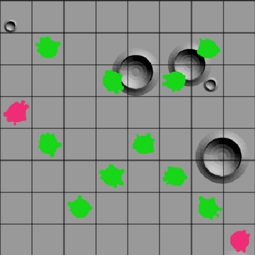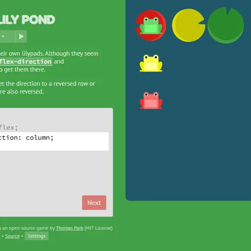
Flexbox Lily Pond is a coding game that teaches CSS flexbox, the layout tool web pages use to line up items in a row or column. Colored frogs sit in the water, and each must reach the lily pad of its own color. You move them by writing real CSS for the pond, and Flexbox Lily Pond updates as you type, so every property shows its effect the moment you write it.
A round at the pond
The lesson sits on one side, the pond on the other, and a code box in between. The box already says display: flex; for the #pond container. You add the missing lines. When every frog lands on a matching pad, the Next button lights up.
The code box is only as tall as the number of lines the level needs. Pressing Enter on the last line submits, and the level counter at the top lets you jump anywhere in the set of 24.
Flexbox Lily Pond Controls
| Action | Keyboard | Mouse | Touch |
|---|---|---|---|
| Type CSS | Type in the code box | — | Tap the code box and use the on-screen keyboard |
| Submit a correct answer | Enter on the last line, or Ctrl + Enter | Click "Next" once it lights up | Tap "Next" |
| Pick a level | — | Click the level counter, then a level number, or use the side arrows | Tap the level counter, then a level number |
| Read about a property | — | Click a highlighted property name in the instructions | Tap a highlighted property name |
| Change difficulty or colorblind mode | — | Click "Settings" under the editor | Tap "Settings" |
Properties you will master
justify-contentto move frogs along a row.align-itemsto move them up or down.flex-directionto turn the row into a column or flip it backward.orderandalign-selfto move one frog on its own.flex-wrapandflex-flowto spread frogs over several lines.align-contentto space those lines apart.
Later levels combine two or three of these at once, which is where the real understanding is tested.
Why it sharpens your thinking
Flexbox is all about axes. There is a main axis and a cross axis, and which one is horizontal depends on a single property. Keeping track of that switch is the same kind of mental rotation you use when a map is turned upside down.
Words like start and end also flip when you reverse the direction. Learning to ask “start of which axis?” builds a careful, precise habit that carries over to any coding work. The game rewards you for reasoning about the rule rather than guessing values.
Strategy for stubborn frogs
- Find the main axis first. Check
flex-directionbefore you pick ajustify-contentvalue. - With a reversed direction, expect
flex-startto sit on the opposite edge. - When only one frog is out of place, use the rule for that frog’s color, not the pond.
- Use
align-itemsfor frogs within a line andalign-contentfor lines that have wrapped. - Click highlighted property names to see every value they accept.
Before You Press Play
Answers and solved levels are saved in your browser. There is no timer, so you can work at your own pace. Once flexbox feels easy, CSS Grid Carrot Patch moves to two-dimensional layouts, and CSS Diner teaches the selectors you would use to target each frog in a real stylesheet.
Tested and updated: